


Fleet maintenance KPIs benchmarking should be simple, right? Track cost per mile, uptime percentage, PM compliance—done. Except every fleet manager running mixed equipment knows these raw numbers lie constantly. A delivery van clocking highway miles gets compared to a bucket truck idling 6 hours daily. Your Class 8 haulers show $0.42 per mile while competitors claim $0.28—but they're not mentioning their routes average 400 miles versus your metro runs averaging 85. The construction division looks efficient at 94% uptime while last-mile delivery struggles at 88%, until you realize one counts weekends as available time and the other doesn't. After building fleet maintenance KPIs benchmarking systems for operations ranging from 15-vehicle HVAC fleets to 800-unit logistics companies, one pattern keeps showing up: most fleets make decisions using metrics that mean completely different things across vehicle types, duty cycles, and operating conditions. The data looks precise. The dashboards look professional. The decisions end up being wrong.
Why Standard KPIs Break Apart in Mixed Fleets
Mixed fleets create measurement chaos that standard metrics just can't handle. Take a regional food distributor running 45 vehicles: refrigerated box trucks for wholesale routes, cargo vans for catering delivery, and stake beds for equipment transport. Their maintenance director pulls monthly KPIs showing reefer trucks cost $1,847 per month versus $623 for cargo vans.
Natural conclusion? Reefer trucks are bleeding money. Except those reefers run 3,200 miles monthly with refrigeration units logging 580 engine hours. The cargo vans? Maybe 1,100 miles with zero auxiliary equipment. When you normalize for actual work performed—factoring in miles, engine hours, and reefer hours—those "expensive" trucks actually run cheaper per unit of work than the vans.
This distortion multiplies across every metric. A landscaping company tracks Mean Time Between Failures (MTBF) and finds their mowers fail every 47 days while dump trucks last 112 days. Sounds like a mower quality problem until you factor in that mowers operate 8 hours daily during season while trucks run 3 hours twice weekly year-round. Per operating hour, the mowers actually demonstrate better reliability.
The worst part is that these misleading metrics drive real budget decisions. Operations cut PM budgets for "expensive" vehicles that actually run efficiently. They delay replacements on "reliable" units that break down constantly relative to usage. They benchmark against industry averages without knowing whether those averages reflect similar duty cycles at all.
The Normalization Formula Most Fleets Miss
Normalized Utilization Score = (Primary Hours × 1.0) + (Idle Hours × 0.3) + (PTO Hours × 1.5) + (Miles ÷ 50)
Prevent costly breakdowns with proactive maintenance.
Fleetelyly helps you schedule, track, and manage every vehicle service efficiently.
- Automated maintenance reminders
- Real-time service tracking
- Parts inventory integration
No credit card required
Primary hours—engine running under load—create baseline wear. Idle hours still accumulate wear but at roughly 30% the rate. Power takeoff operations like running a boom or hydraulic system create about 50% more stress than standard operation. Highway miles convert at 50 miles per normalized hour, though city operations need adjustment closer to 25-30 miles per hour equivalent.
Consider how this changes perspective on a utility truck showing:
-
89 engine hours monthly
-
34 hours idling at job sites
-
42 hours running aerial boom
-
1,250 miles driven
Raw metrics: 89 hours, moderate use.
Normalized score: 164 equivalent hours, intensive use.
That "lightly used" truck suddenly shows wear equivalent to a highway vehicle running over 8,000 miles. Your maintenance intervals, budget projections, and replacement timing all shift accordingly.
The formula needs adjustment by operation type. Refuse trucks might weight idle time at 0.5 due to hydraulic cycling during stops. Refrigerated units need separate tracking for reefer hours at 0.8 weighting since they create engine load without drive wear. But the principle stays the same: normalize everything to equivalent wear units before comparing anything.
Building Peer Groups That Actually Mean Something
Industry averages become meaningless when your "peers" operate differently. A plumbing fleet in Denver shares almost nothing operationally with one in Houston, even running identical vehicle types. Altitude affects engine wear. Stop-and-go patterns differ. Weather drives completely different failure modes.
Real peer groups need matching across four dimensions:
Duty Cycle Matching Group vehicles by work pattern, not just type. A Ford Transit used for parts delivery—75 stops, 90 miles daily—operates nothing like an identical Transit doing mobile service at 8 stops and 140 miles. The delivery van sees 10x more door cycles, starter wear, and transmission shifts per mile.
Environmental Bands
-
Severe winter
4+ months below freezing, road salt exposure
-
Moderate
Seasonal variation without extremes
-
Hot/dusty
4+ months above 90°F, high particulate
-
Coastal
Salt air exposure, high humidity
| Band | Definition |
|---|---|
| Severe winter | 4+ months below freezing, road salt exposure |
| Moderate | Seasonal variation without extremes |
| Hot/dusty | 4+ months above 90°F, high particulate |
| Coastal | Salt air exposure, high humidity |
Age Stratification Never compare 2-year-old vehicles against 5-year-old ones directly. Maintenance costs follow a curve, not a line. Years 0-2 are mostly PM and warranties. Years 3-4 add wear items like brakes and tires. Years 5+ bring major component work. Create cohorts within 2-year windows for anything resembling an apples-to-apples comparison.
Scale Factors
-
Micro
Under 25 units
-
Small
25-75 units
-
Regional
75-250 units
-
Enterprise
250+ units
One HVAC company operating 67 vehicles spent months frustrated that their maintenance costs ran 35% above "industry standard." When they built proper peer groups—matching climate, duty cycle, age mix, and scale—they discovered they actually ran 8% better than true peers. The "industry standard" they'd been chasing came from sunbelt fleets running newer vehicles on predictable routes.
Sample Dashboards That Reveal Real Performance
Forget vanity metrics with green lights everywhere. Effective fleet maintenance KPIs benchmarking needs multiple views that surface actual problems.
Primary Operations View
-
Cost per Normalized Hour (target
$18-24 for medium duty)
-
Maintenance Ratio
Maintenance cost ÷ (Depreciation + Maintenance)
-
Unscheduled Repair Frequency per 1,000 normalized hours
-
PM Compliance adjusted for utilization variance
A concrete contractor found their dump trucks showed terrible cost per mile ($1.94) but solid cost per normalized hour ($19.20). The trucks sat idle between pours but worked hard when running. The normalized view prevented them from mistakenly downsizing the dump truck fleet based on a metric that didn't reflect how those trucks actually operated.
Variance Analysis Panel
-
Actual vs Budget by normalized utilization quartile
-
Peer variance by matched cohort
-
Failure rate deviation from manufacturer baseline
-
Parts cost variance from national averages
Show variance as percentages with context, not raw numbers. "+23% parts cost versus peer median (inflation adjusted)" means something actionable. "$847 over average" means nothing without a denominator.
Predictive Indicators Grid
-
PM Overdue Aging
units × days overdue
-
Open Recall exposure in dollar equivalents
-
Technician capacity vs projected demand
-
Critical parts coverage ratio
Watch for correlation patterns. When PM compliance drops below 85% normalized, unscheduled repairs spike 40-60 days later almost without fail. When technician overtime exceeds 15%, quality issues tend to surface within 6 weeks. These leading indicators matter far more than backward-looking cost reports.
Component Failure Patterns
-
Electrical failures per 10,000 normalized hours by model year
-
Brake repairs normalized by weight class and duty type
-
Engine issues grouped by displacement and fuel type
-
Transmission problems by configuration and application
This view revealed that one distribution fleet's "transmission problems" actually concentrated in vehicles spec'd with wrong gear ratios for their route profiles. The transmissions weren't failing—they were being destroyed by improper application. That's a spec problem, not a maintenance problem, and you'd never find it looking at raw vehicle-level data.
Quarterly Cadence Tied to Decision Gates
Annual planning cycles can't respond to fleet dynamics. Monthly reviews create noise without enough pattern to act on. Quarterly cadence balances signal detection with actual decision-making capability.
Quarter-End Month 1: Data Collection and Normalization
First two weeks after quarter close, gather and normalize all metrics—maintenance records, utilization data, fuel consumption, incident reports. Apply your normalization formulas consistently. Flag any vehicles that jumped utilization categories. That delivery van now doing long-haul moves needs reclassification before it distorts everything downstream.
Operational software with automated data feeds can cut this from 40 hours down to a few hours of validation. But even manual collection beats making decisions on non-normalized data. One midwest utility spent three days quarterly building normalized reports by hand. That investment prevented two incorrect vehicle replacements that would have cost around $180k based on misleading raw metrics.
Quarter-End Month 2: Analysis and Peer Comparison
With normalized data ready, run your comparisons. Look for vehicles performing 20% outside peer groups. Identify systemic issues versus one-off problems. Check whether certain technicians, vendors, or locations drive variance.
Create exception reports for your maintenance governance framework. Vehicles exceeding normalized cost thresholds trigger deeper review. Units approaching major service intervals enter the planning pipeline. Age-based replacement candidates get flagged for economic analysis.
This is when patterns emerge. A food distributor noticed their refrigerated units matched peers on mechanical costs but ran 40% higher on reefer maintenance. Investigation revealed drivers weren't running required daily reefer cycles, causing moisture buildup and premature failures. A procedural fix solved what looked like an equipment problem.
Quarter-End Month 3: Decision Gates and Forward Planning
-
Repair vs Replace Gate
When trailing 12-month normalized maintenance exceeds 65% of replacement cost ÷ expected remaining life
-
PM Interval Adjustment
When failure rate exceeds manufacturer baseline by 30% despite compliance
-
Vendor Performance Review
When normalized repair costs exceed peer average by 25%
-
Capacity Planning Trigger
When technician utilization exceeds 85% for two consecutive quarters
Each gate needs a defined action, not just a flag. Vehicle hits replacement threshold? It automatically enters the fleet maintenance budgeting and chargebacks process for next quarter capital planning. PM intervals need adjustment? Schedule a review with the manufacturer rep and your top technician within two weeks.
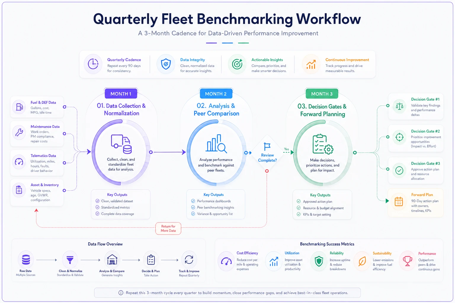
The diagram shows the quarterly cadence and how data flows from collection to decision gates.
Turn analysis into decisions with clear thresholds.
Hidden Traps in Benchmarking Data
Even with solid normalization, benchmark data hides traps. The most dangerous: survivorship bias. Industry benchmarks typically come from fleets successful enough to participate in surveys. The operations running 40% above optimal? They're too busy fighting fires to submit data. You end up comparing against winners, not averages.
Accounting methodology creates another trap. Some fleets expense tires, others capitalize them. Some include indirect costs like shop utilities, others don't. One company discovered their "high" maintenance costs included shop rent that peers tracked separately. After proper categorization, they moved from bottom quartile to above-average performance without changing a single operational thing.
Warranty recovery distorts everything when handled inconsistently. Fleet A shows $500 monthly maintenance per truck. Fleet B shows $750. Except Fleet A aggressively pursues warranty claims, recovering around $300 monthly per unit. Fleet B barely files claims and eats costs the manufacturer should cover. Real maintenance burden? Fleet B actually runs cheaper—they just don't collect money owed to them.
The timeframe selection trap catches even sophisticated operations. Compare January-March against October-December in northern climates and winter months show 50-70% higher costs from cold starts, salt damage, and heating system repairs. Always compare similar seasonal periods or use rolling 12-month averages for normalized views.
Making Normalization Work Without Perfect Data
Most fleets don't have pristine data for ideal normalization. Telematics might track engine hours but miss PTO time. Maintenance systems capture repairs but not always root causes. Don't let perfect become the enemy of useful—start with approximations and refine over time.
Basic normalization beats no normalization every time. Can't track idle hours separately? Estimate based on route types. Urban routes typically idle 25-35% of engine time; highway runs closer to 5-10%. Missing PTO hours? Use job counts as a proxy. Each boom truck job might average 2.3 PTO hours based on sampled data.
Build adjustment factors through sampling if systematic tracking isn't feasible. Track 10% of your fleet intensively for one quarter, then use those ratios to estimate the other 90%. A regional utility couldn't add sensors to track PTO hours across 127 trucks, so they instrumented 15 trucks for three months, found consistent patterns by job type, then applied factors based on dispatch records they already had.
Track 10% of your fleet intensively for one quarter, then use those ratios to estimate the other 90%.
Start with the metrics that drive the biggest decisions. Normalized utilization affects PM scheduling, replacement timing, and budget allocation. Get that right first. Granular component failure tracking can wait until core normalization is running smoothly.
Technology Integration That Actually Helps
The promise of AI-powered operational software in fleet management is real: connect your existing systems and automatically normalize metrics without manual calculation. When it works well, telematics data flows into maintenance records, matches with fuel consumption, factors in weather data, and produces normalized KPIs without spreadsheet manipulation.
But integration often breaks on details nobody mentions upfront. Telematics might track engine hours in decimal format (127.3) while your maintenance system uses hour:minute (127:18). The systems "integrate" but produce garbage data. Or vehicles carry different ID numbers in each system with no master reference file linking them.
The operational platforms that succeed keep normalization logic separate from source systems—pull raw data, apply transformations in a middle layer, then push normalized metrics to dashboards. When telematics vendors change APIs or maintenance systems update fields, your normalization doesn't break. Just the data pipeline connections need adjustment.
Effective fleet software also preserves both raw and normalized views. Sometimes you need actual costs per vehicle for accounting. Other times you need normalized comparisons for operational decisions. AI automation helps by flagging when metrics deviate beyond expected ranges, but human review stays essential for the context these systems can't interpret.
Fleet maintenance KPIs benchmarking without normalization is like navigating with a broken compass. You'll move confidently in the wrong direction.
Start with basic normalization even if your data isn't perfect. Build peer groups that match your operational reality, not just vehicle types. Create dashboards with multiple views—operational, financial, and predictive. Run quarterly reviews tied to specific decision gates, not just reporting exercises.
Behind every normalized metric sits a real vehicle with real wear patterns doing real work. A number showing green on a dashboard means nothing if trucks keep breaking down. Use normalization to see clearly, but verify against operational reality. When the two align—when your normalized metrics predict what actually happens in your shop—you've built a benchmarking system worth trusting.
The fleets that get this right stop chasing their tails on cost reduction. They know which vehicles underperform, which processes need attention, and which investments actually drive returns. In mixed fleet operations where complexity never stops, that kind of clarity matters more than any dashboard.
Ready to maximize fleet uptime and reduce maintenance costs?
Join 2,000+ fleet managers using Fleetelyly to streamline maintenance workflows and improve vehicle reliability.